
The College Board’s annual release of the Trends in College Pricing and Student Aid always contains a wealth of information on the latest enrollment and financial data for higher education. It is also notable that this report is much more informative, useful, and usable than anything put out by the Department of Education. If you don’t have time to wade through the whole thing, here are some highlights.
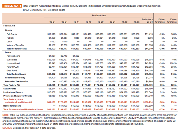
First up is the table showing student aid amounts by program and year. Total federal aid is around $141 billion per year, up from $120 billion in 2003-04 but down considerably from the $216 billion in 2013-14. Federal spending on Pell Grants is up modestly, though still below the historical peak. The trends in student loans are diverging a bit—subsidized and unsubsidized loans are down markedly from their peak, while Grad PLUS has been growing.
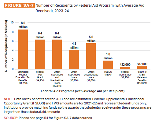
Another revealing graphic shows the number of recipients by aid programs and the average amount received. Many are surprised when they find out that the education tax benefits are the most widespread aid, with 8.6 million students taking advantage of at least one tax benefit. The number of students receiving Pell Grants and student loans are both 6.4 million, while work study and GI Bill are comparatively tiny.
[RELATED: State Disinvestment in Higher Education is Still a Myth]
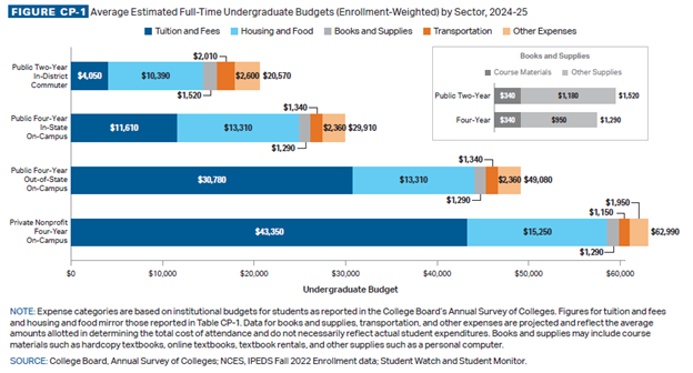
The chart showing student budgets is also enlightening. The total budget for a student attending a private nonprofit is twice as much as the budget for a student attending a public four-year college, and three times as much as a student attending a public two-year college. The composition of the budget is also interesting. Tuition and fees make up only about a fifth of the budget for students at public two-year colleges, a little over a third for students at public four-year colleges, and around two-thirds for students at private nonprofit colleges.
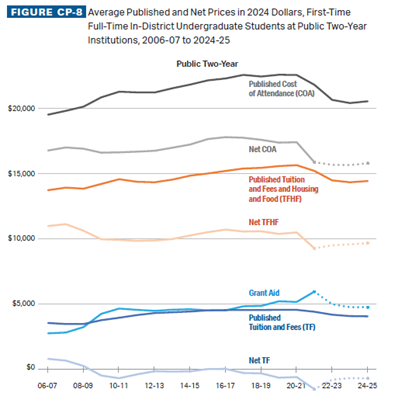
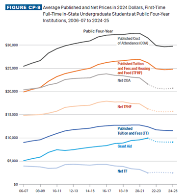
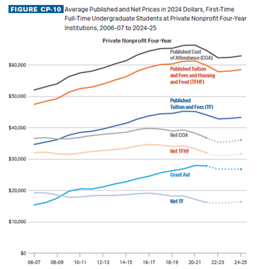
Of course, published costs can be dramatically different from net costs, and the College Board report documents trends in net costs too. At public two-year colleges, average net tuition and fees are negative, meaning that on average, we have free community college in this country, and have for over a decade. Net costs including room and board have been hovering around $10,000 per year and including all costs around $16,000.
At public four-year colleges, net tuition and fees have been trending down, and are now around $2,500 a year. Net costs including room and board are around $16,000 and including all costs are around $21,000.
[RELATED: Details on the FAFSA Fiasco are Starting to Dribble Out]
Net tuition at private nonprofit colleges is around $17,000 per year. Net costs including room and board are around $32,000 and including all costs are around $36,000.
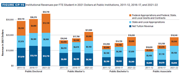
Lastly, this chart shows college revenues by source. This chart highlights a few underappreciated facts. First, there is very little difference in revenues for public associate degree colleges and public bachelor’s degree colleges. Second, state and local appropriations are very consistent across types of colleges. Third, federal funding is also remarkably uniform across college type, with the exception of doctoral colleges, which receive about $7,000 more per student than the other types of colleges. And fourth, the additional revenue at doctoral colleges is entirely due to higher federal funding and higher net tuition. For example, doctoral colleges have about $16,000 more revenue per student than associate colleges and this is due to an extra $9,000 in net tuition revenue and an extra $7,000 from federal funding.
There are only a few things to be wary of in the report.
First, the relationship between state funding and tuition—or rather the lack of such a relationship—is a hobby horse of mine, but even if it wasn’t, Figure CP-13A is wrong to use percentages. It shows the percentage change in net tuition and state funding over time. It should show the dollar change instead the percentage change. The “state disinvestment causes increases in tuition” argument is about dollars (e.g., a $1 cut in state funding per student requires a $1 increase in tuition to compensate), not percentages. For example, state and local funding for community colleges is around $9,160, while net tuition is $3,840, so a change of $1,000 would be 11 percent of state and local funding but 26 percent of net tuition.
Second, Figure SA-18 shows the maximum Pell Grant over time along with costs at four-year colleges. The absence of costs for two-year colleges is conspicuous and would show that Pell Grant funding is already in excess of tuition at such colleges. It would also undermine the implicit message that “Pell Grant funding hasn’t increased enough” when I think the more accurate reading is “college costs have increased too much.”
While I would certainly be happy to see next year’s reports make changes to these two figures, these are minor gripes about an overall excellent and extremely useful report.
Follow Andrew Gillen on X.
Image by Johnstocker — Adobe Stock — Asset ID#: 167734839